CO2412 Computational Thinking Contents
Lecture 12 - Probability
Lecture 16 - Info Representation.pdf
Information Representation & Relative Frequency
Organising & Presenting Data Graphically
Data in raw form is usually not easy to use for decision making.
Some type of organisation is needed:
- Table
- Graph
Techniques Reviewed here:
- Bar Charts & Pie Charts
- Ordered Array
- Stem & Leaf Display
- Frequency Distributions, histograms and polygons
- Contingency Tables
- Scatter Diagrams
Variables
A variable is a characteristic that changes or varies over time and/or for different individuals or objects under consideration.
Examples include:
- Hair Colour
- White Blood Cell Count
- Time to failure of a computer component
Types of Variables
Quantitative - Discrete & Continuous
Qualitative
Tables and Charts for Categorical Data
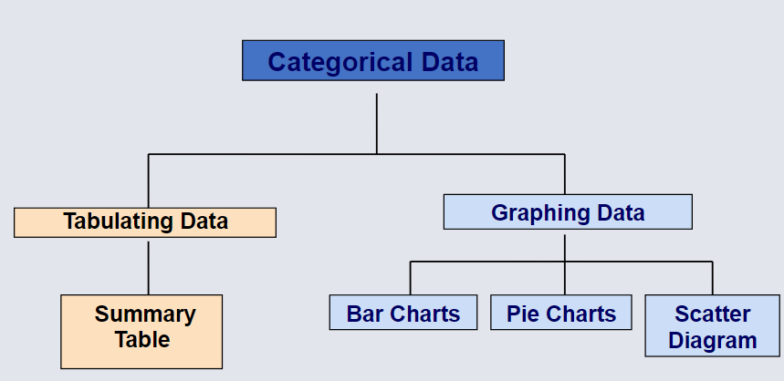
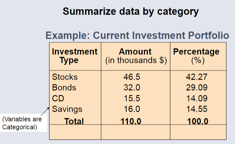
The Summary Table
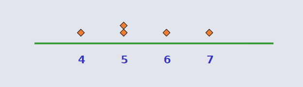
Dot Plots
The simplest graph for Quantitative Data. Plot the measurements as points on a horizontal axis, stacking the points that duplicate existing points.
Example Set using Dot Plots
The set used for the following example is: 4, 5, 5, 7, 6
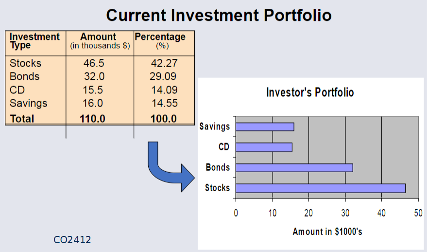
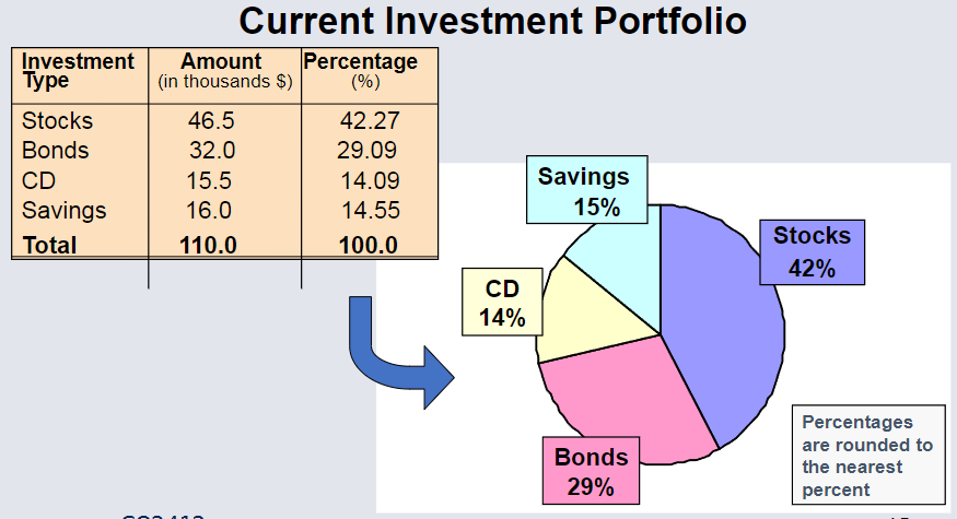
Bar & Pie Charts
Bar, and Pie charts are often used for categorical data.
The height of the bar or size of the pie shows the frequency or percentage for each category.
Example Bar Chart
Example Pie Chart
Organising Numerical Data
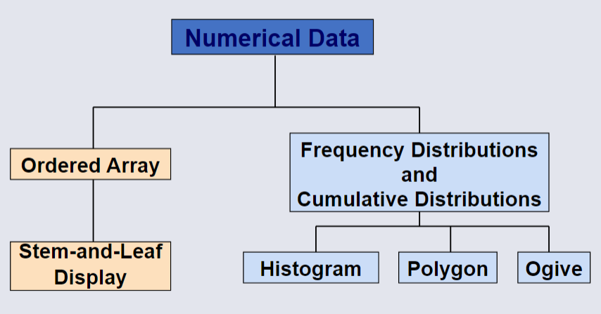
The Ordered Array
An ordered array arranges data in rank order, from minimum and maximum values within the dataset.
This format provides several analytical benefits:
- Shows Ranges: Clearly defines the minimum and maximum values within the dataset.
- Highlights Variability: Offers insights into the distribution and variability across the range.
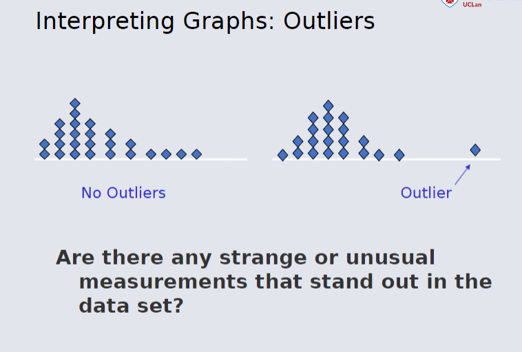
- Identifies Outliers: Makes unusual observations easier to spot.
- Limitations: In large datasets, the ordered array becomes less practical as a tool for analysis.
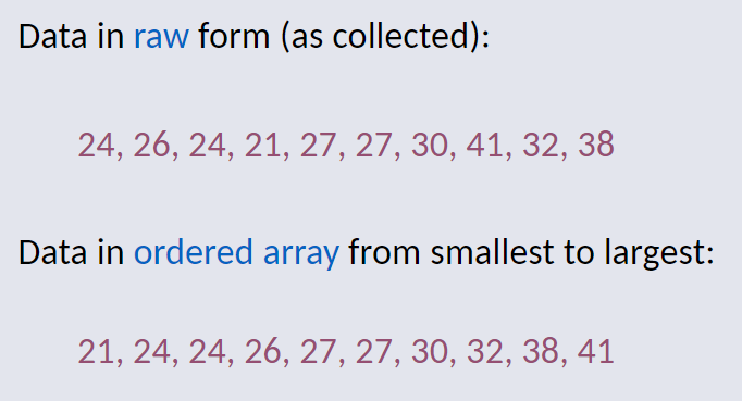
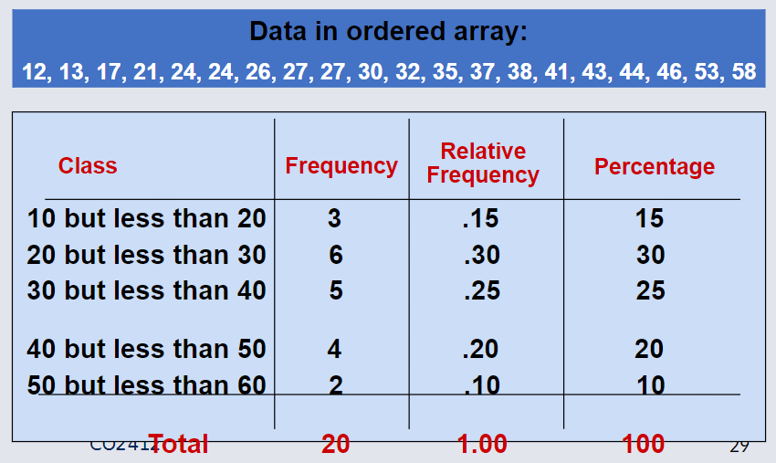
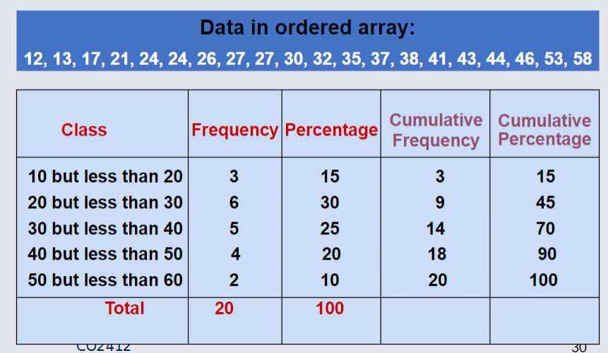
Example Ordered Array
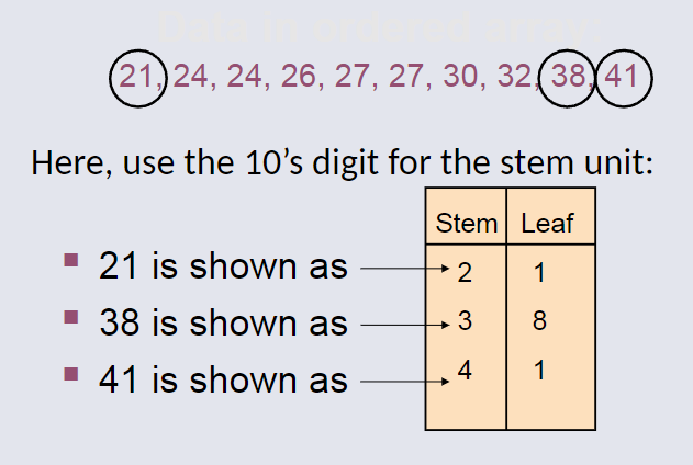
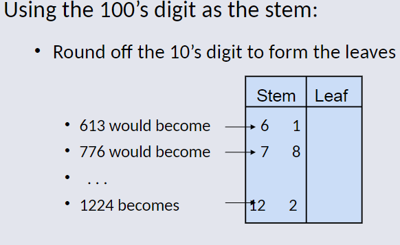
Stem-and-Leaf Diagram
A simple way to see distribution details in a dataset.
Method: Separate the sorted data series into leading digits (Stem) and the trailing digits (leaves)
Example Stem-and-Leaf Diagram
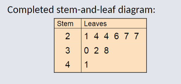
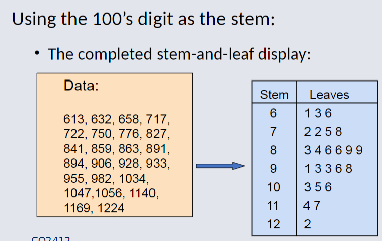
Completed Stem-and-Leaf Diagram
Using other Stem Units
Completed Stem-and-Leaf diagram for other Stem Units
Frequency Distribution
A frequency distribution is a structured representation of data, often displayed as a list or a table.
The frequency distribution includes:
Class Groupings: Ranges or intervals within which data values fall
Corresponding Frequencies: The number of data points that fall into each grouping or category.
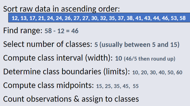
Class Intervals & Class Boundaries
Each Class Grouping has the same width. By determining the width of each interval Width of interval (approx) = range / number of desired class groupings.
Usually at least 5 but no more than 15 groupings.
Class boundaries never overlap.
Round up interval width to get desirable endpoints.
Why use Frequency Distribution
This format helps to summarise and analyse data effectively by highlighting patterns and trends.
Example Frequency Distribution
A manufacturer of insulation randomly selects 20 winter days and records the daily high temperature.
Cumulative Frequency
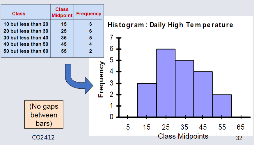
The Histogram
A graph of the data in a frequency distribution is called a histogram.
The class boundaries (or class midpoints) are shown on the horizontal axis.
The vertical axis is either frequency, relative frequency, or percentage.
Bars of the appropriate heights are used to represent the number of observations within each class.
Example Histogram
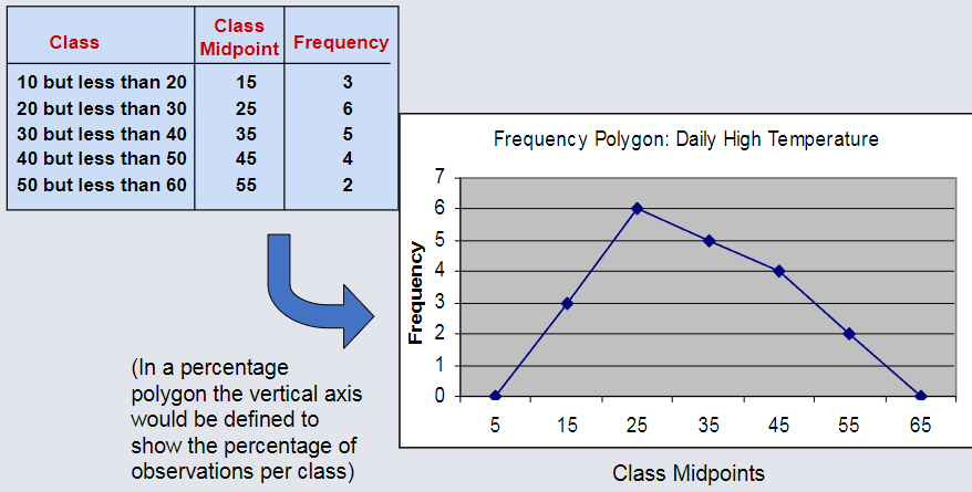
The Frequency Polygon
Misusing Graphs & Ethical Issues
Guidelines for good graphs:
- Do not distort the data
- Avoid unnecessary adornments (no "chart junk")
- Use a scale for each axis on a two-dimensional graph
- The vertical axis scale should begin at 0
- Properly label all axis'
- The graph should contain a title
- Use the simplest graph for a given dataset
Summary
Data in raw form are usually not easy to use for decision making -- Some type of organization is needed:
Table
Graph
Techniques reviewed in this chapter:
Bar charts, pie charts, and Pareto diagrams
Ordered array and stem-and-leaf display
Frequency distributions, histograms and polygons
Cumulative distributions and ogives
Contingency tables and side-by-side bar charts
Scatter diagrams and time series plots