CO3722 Data Science
CO3722 Lecture 4 - Data Cleaning
Lecture Documents
Written Notes

Starter Questions
- Why is there a need to visualise data for example, how could this be beneficial during the early stages of analysis.
- What insights can be gathered from using visuals. (e.g. graphs & charts)
Visualisation
Analyse data to support reasoning
- To develop hypotheses
- To find patterns
- To discover errors
Communicate to various audiences
- Share, Persuade & Collaborate.
Psychology
- How do people perceive and comprehend visual information?
- Develop principles for creating effective visualisations.
Example
Bar charts and Histograms - See immediate patterns
Line Charts - Identify Trends Rising
Pie Charts - View the magnitude of a factor compared to others
Other Examples Include:
- Colour maps
- Story Telling
- Network Designing
- Explorative Designing
- Data Models
Learning Objectives
- Prepare data for appropriate visualisation
- Evaluate a dataset for quality control
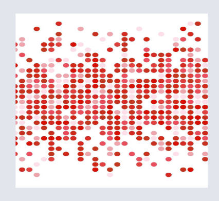
Example of Noisy Data
Nature of the Data
Data Types
Quantitative
- Discreet Data - Numerical, finite number. E.g. number of employees in an office building.
- Continuous Data - Can take any value. E.g. height, weight or time.
Qualitative
- Categorical - Quality or Characteristic
- Nominal - Without rank or order. E.g. Eye colour, type of car, or marital status.
- Ordinal - Natural order or rank. E.g. Satisfaction ratings (First, Second, Third), Food Sizes (Large, Medium, Small)
Basic Chart Examples
Dataset
year = [1960, 1970, 1980, 1990, 2000, 2010]
population = [449.48, 553.57, 696.783, 870.133, 1000.4, 1309.1]
Basic Chart Plotting
Line Chart
Utilises Style from the MatplotLib Library.
style.use('ggplot')

plt..plot(year, population, color='red')
plt.xlabel('year')
plt.ylabel('population in millions')
plt.title('population up to 2010')
plot.show()
Bar Chart
bar_width = 2.5

plt.bar(year, population, bar_width, color='black')

plt.xlabel('year')
plt.ylabel('population in millions')
plt.title('population up to 2010')
plt.show()
Scatter Plot
x = np.linspace(0, 10, 40)
y = np.cos(x)

plt.scatter(x, y, marker='o', color='green')

plt.xlabel('X-Axis')
plt.ylabel('Y-Axis')
plt.show()
Multiple Lines on One Line Chart
Dataset
plt.plot(x1, y1, color='green', label='x1 vs y1')
plt.legend()

plt.plot(x2, y2, color='black')
plt.legend()

plt.xlabel('X-Axis')
plt.ylabel('Y-Axis')
plt.title('2 lines in a single graph')
plt.show()
Basic Rules for Visualisation
- Follow formatting Rules
- Title
-
Axis
-
Context
-
Relate this to questioning. E.g. Shopping patterns; climate change; fraud detection - "changes in patterns"
-
Specific purpose and value
-
Has meaning
-
To simply complex data.
MatPlotLib Visualisations
Quote
Matplotlib is a Python 2D plotting library that produces publication quality figures in various hardcopy formats and interactive environments across platforms….